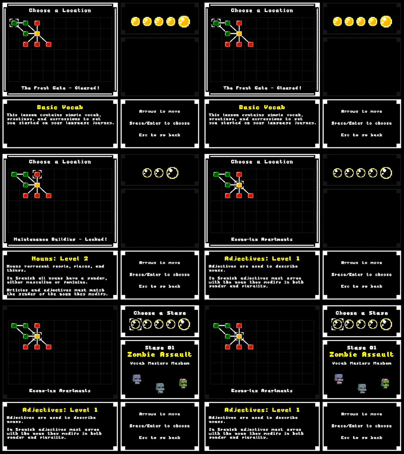
I mentioned in the last post that I don’t want to overwhelm players with too much information as soon as they start. In the last post I talked about configurable modals to explain new concepts. The latest update is the ability to set when items, enemies, and weapons will be unlocked via configuration.
The tricky part here is that the game path branches early on, and I want to make sure there are multiple ways to unlock items, so players don’t miss something, or get it much later in the game than intended.
The system I came up with allows a unit to be assigned to one or more stages, and when any of those stages is completed the item is unlocked. I also added a modal conditional type based on unlocked items, so I can easily define explanatory popups to display when a new item is unlocked.
Unlocked items are stored in list in each user’s profile, and I’ve added checks in the SpawnManager classes to ensure that locked items are never spawned.
getUnlockedItemsForStage(stageId) {
  const itemConfigs = unlockableItemMap.filter(i => i.stage === stageId);
  return itemConfigs.map(c => c.item);
}

isUnlocked(itemType) {
  if (!this.db.isUserLoggedIn()) {
    return false;
  }

  if (this.db.userProfileLoaded) {
    const userUnlocked = this.db.userProfile.unlockedItems;
    return GLOBAL_UNLOCKED_ITEMS.includes(itemType)
      || (userUnlocked != null && userUnlocked.includes(itemType));
  }
  throw Error('user profile has not been loaded. Call loadUserProfile() first');
}
On a side note, I’m also working on UI tweaks here and there. I’ve gone through a couple of iterations of the active panel indicator on the map screen. For my first try I made the active panel white, and the inactive panel gray, but I found that this did not stand out enough, and I was frequently confused about which panel was active. For the next iteration I made the entire border blink for the active panel. But I found that this was distracting and pretty hard on the eyes. For my latest try I’m keeping the white border, but adding thin, blinking lines on the inner edges. This is definitely an improvement. It’s clear which panel is active and not too hard on the eyes (I think).
